Rebranding for Landim Corretora de Seguros, strengthening their visual identity with a project that highlights their more than 40 years of experience in the insurance market in Brasilia.
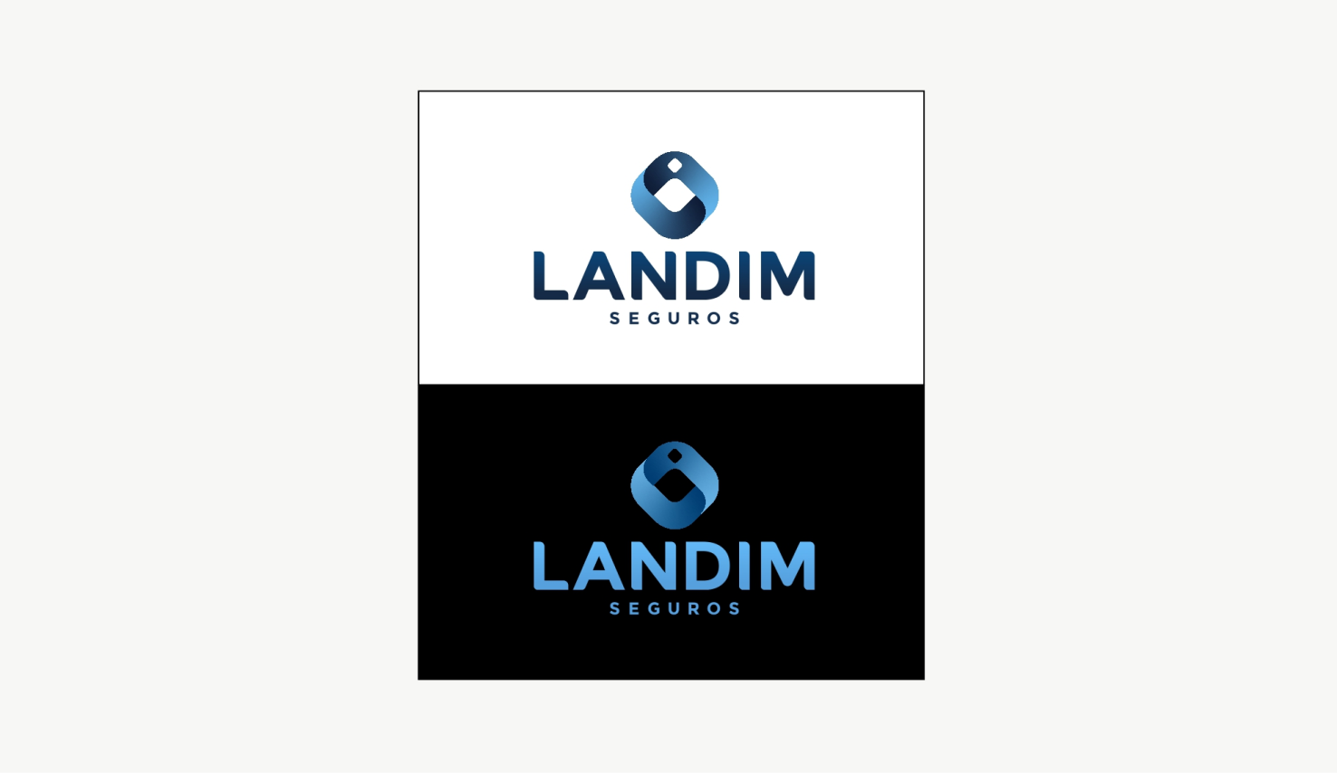
The new logo was developed from the ring of the previous logo, representing the link, the union, the attention and the relationship of trust established between insurer and insured. The circular three-dimensional shape is reminiscent of the Moebius strip, a symbol of continuity and connection.
Management
Alessandra Pinheiro
Design
Yan Diniz