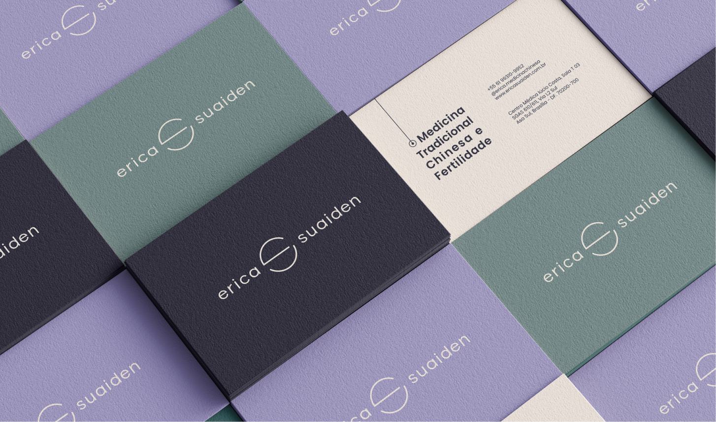
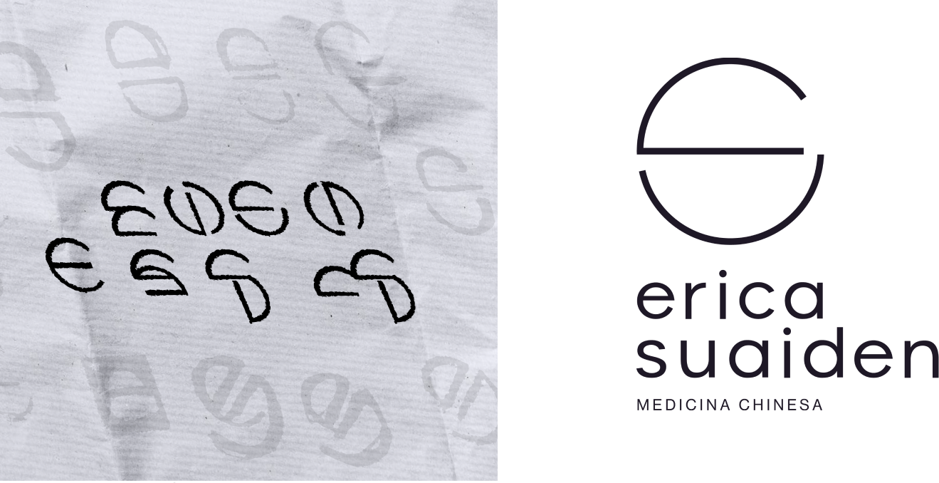
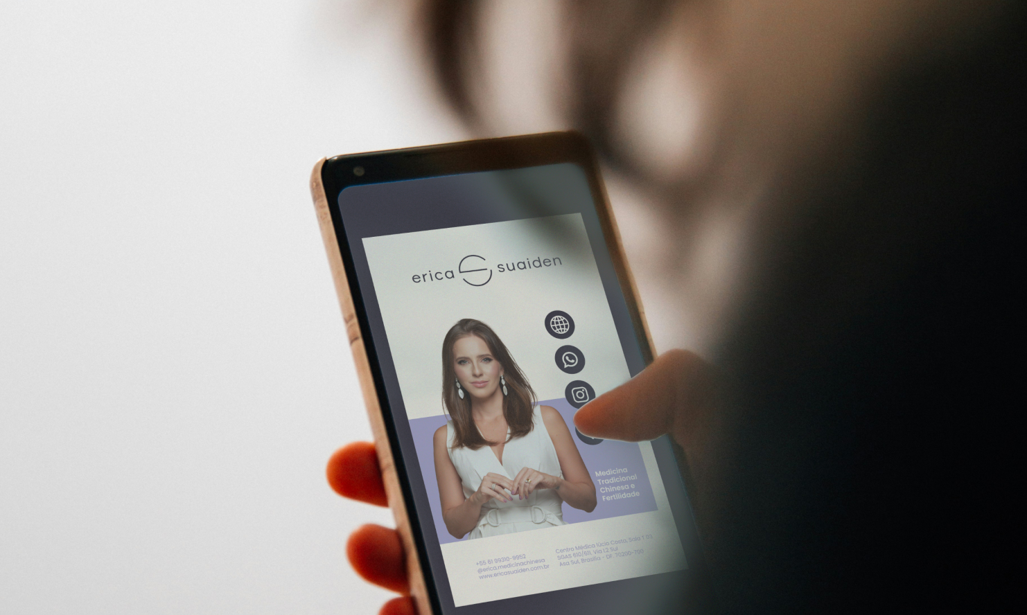
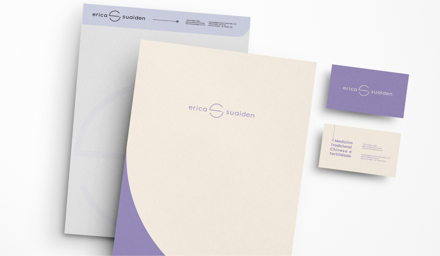
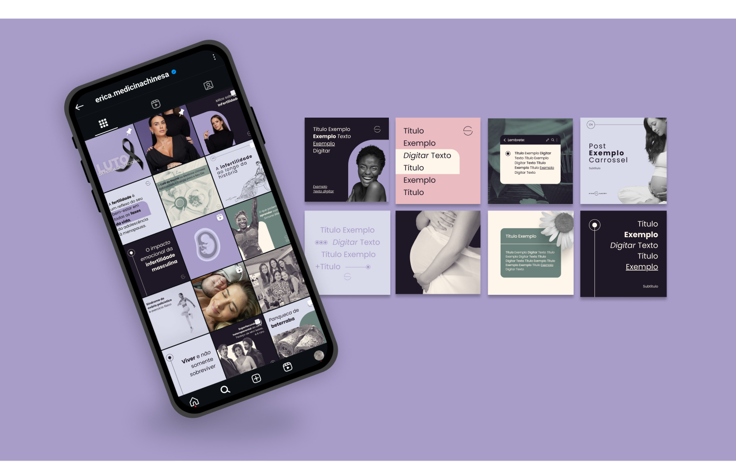
The brand, visual identity and website for Erica Suaiden's traditional Chinese medicine and fertility clinic. The color palette and graphic elements chosen synthesize a welcoming and empathetic journey, using responsible, direct and assertive language to connect with clients.
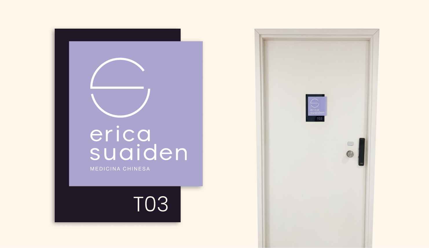
The designs incorporate concepts of circularity, evoking gestation as archetypal inspirations. This creative approach is reflected in the construction of the letters "E" and "S", Erica Suaiden's initials, which intertwine.
Management
Alessandra Pinheiro
Design
Yan Diniz
Motion
Yan Diniz
Website
Diego Maia
Rebeca Castro